The smart place to play, where kids learn and explore
NICKELODEON
Role
Design Director and IC
Team
Product owners, Illustrators, Animators, Engineers, PMs
Defined a kid-first product system across mobile, web, TV, and wearable — reaching 2M daily users and 47M+ downloads.
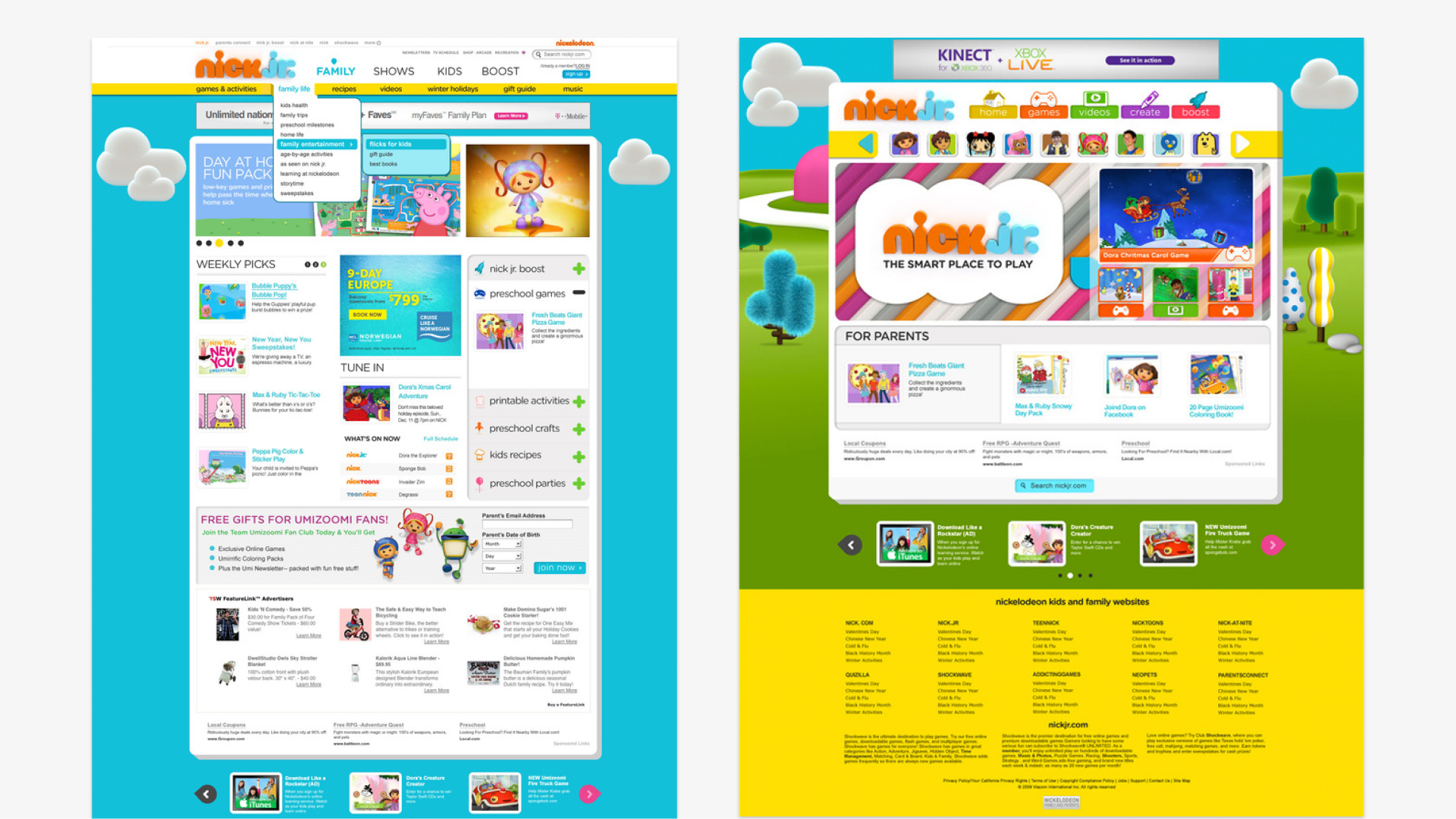
STARTING POINT
A product built around ads, not the kids
Nick Jr. had incredible content and one of the most beloved brands in children's media. But the product experience didn't reflect that. Navigation was driven by monetization. Ads interrupted the flow. The experience was fragmented between kids and parents, and there was no cohesive product vision holding it together.
For a preschool audience, that's a big problem. These kids can't read. They can't navigate complexity. They need an experience that just works — every time, on every device.
INSIGHTS
Designing for preschoolers means unlearning many assumptions.
Before any sketches, I spent time understanding how this specific audience actually interacts with technology. What we learned shaped every decision:
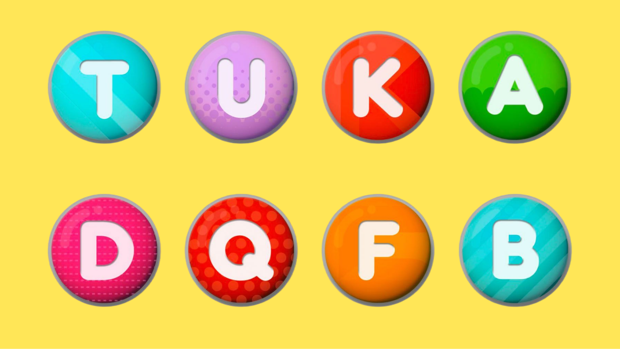
Motor skills are still developing — interactions need to be forgiving, with large tap targets and no precision required
Visuals over text, always — navigation has to be driven by characters and imagery kids already recognize and trust
Immediate feedback is everything — every tap needs a clear, delightful response or kids think it didn't work
Repetition builds confidence — familiar patterns aren't boring to a 3-year-old, they're reassuring
Parents are in the room too — the experience has to give kids independence while giving parents visibility and control
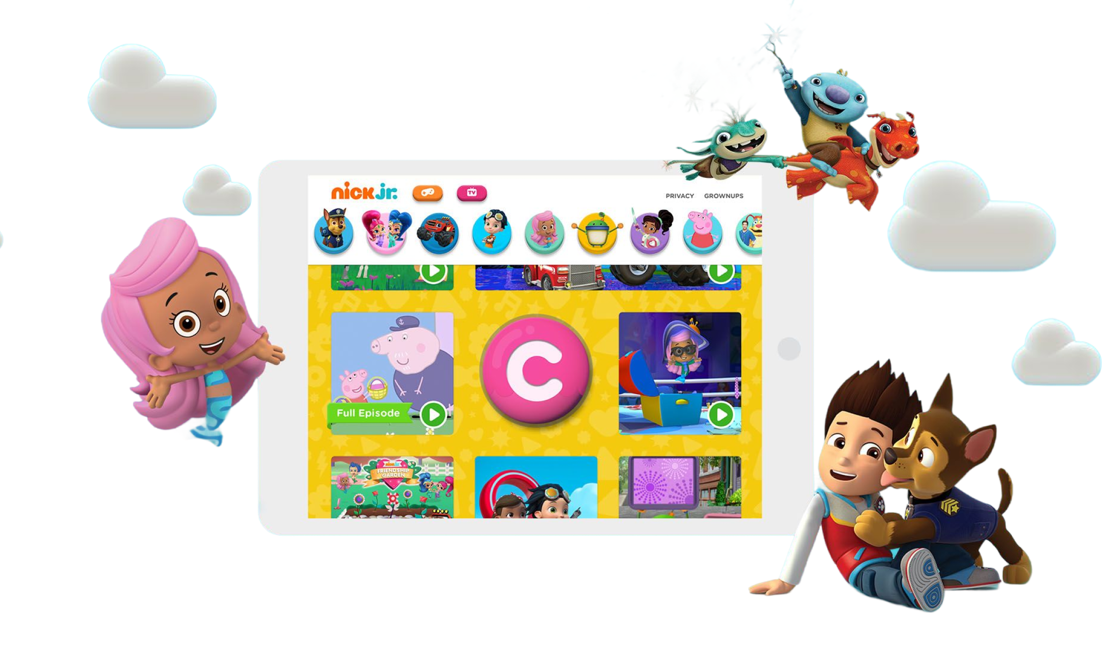
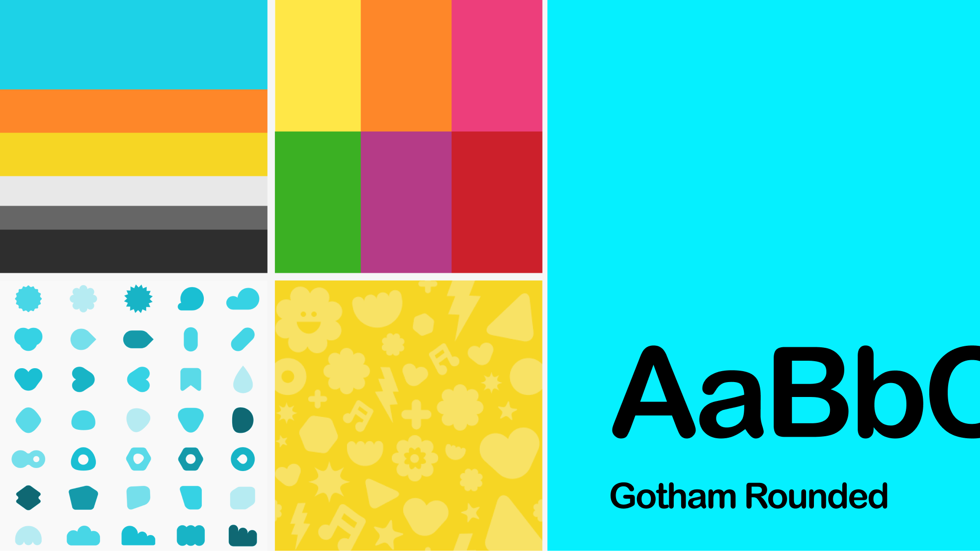
BUILDING THE SYSTEM
Playful, but built to scale
Armed with those insights, I defined a visual language that felt unmistakably Nick Jr. — bright, expressive, character-led — while being systematic enough to scale across a growing content library and multiple platforms. Reusable components, consistent interaction patterns, and a clear design language that any team could build on.
SOLUTION
The biggest design challenge was maintaining consistency across four very different contexts — each with its own constraints and interaction model:
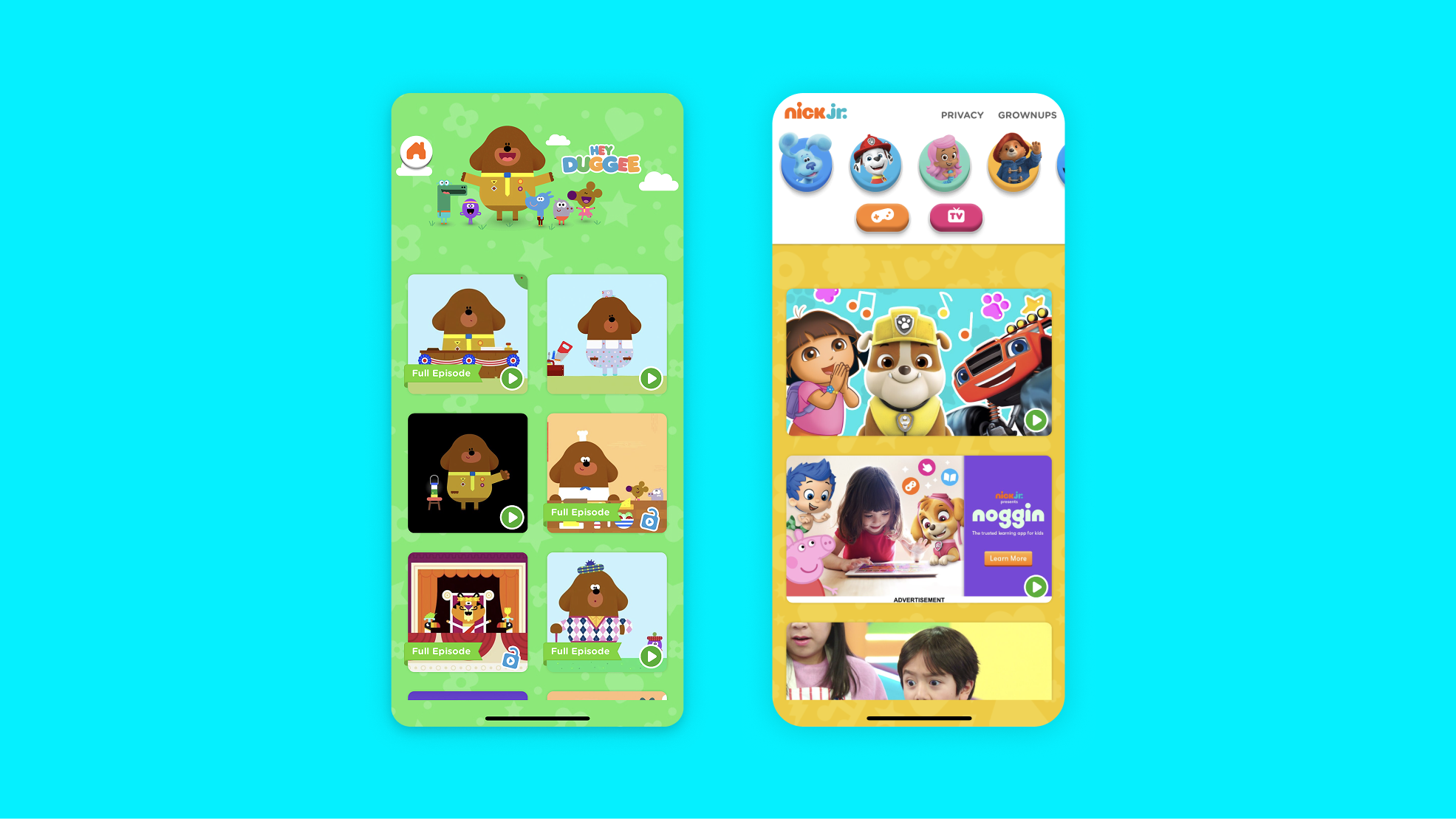
Mobile — touch-first, simple, built for little fingers
TV — remote navigation, lean-back viewing, big and readable from across the room
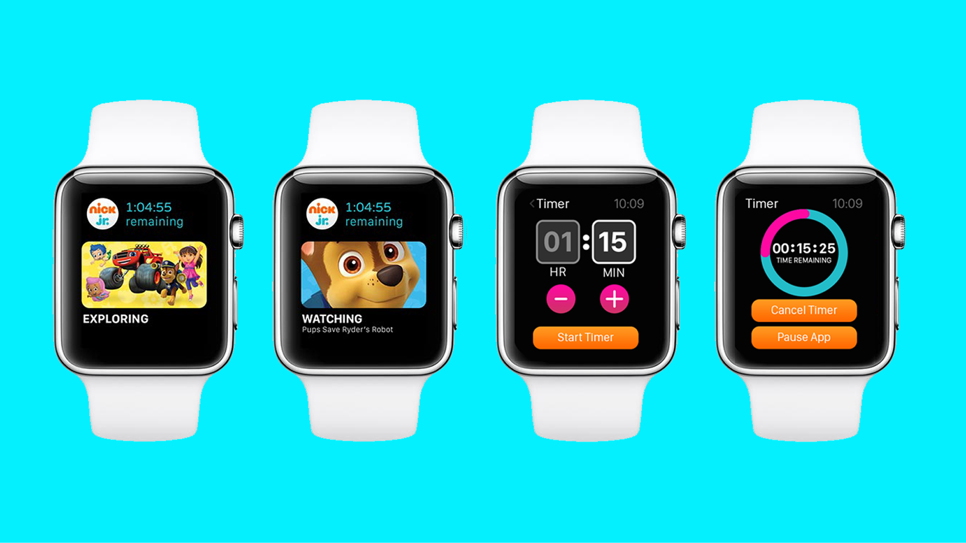
Watch — quick, glanceable moments kids could enjoy independently
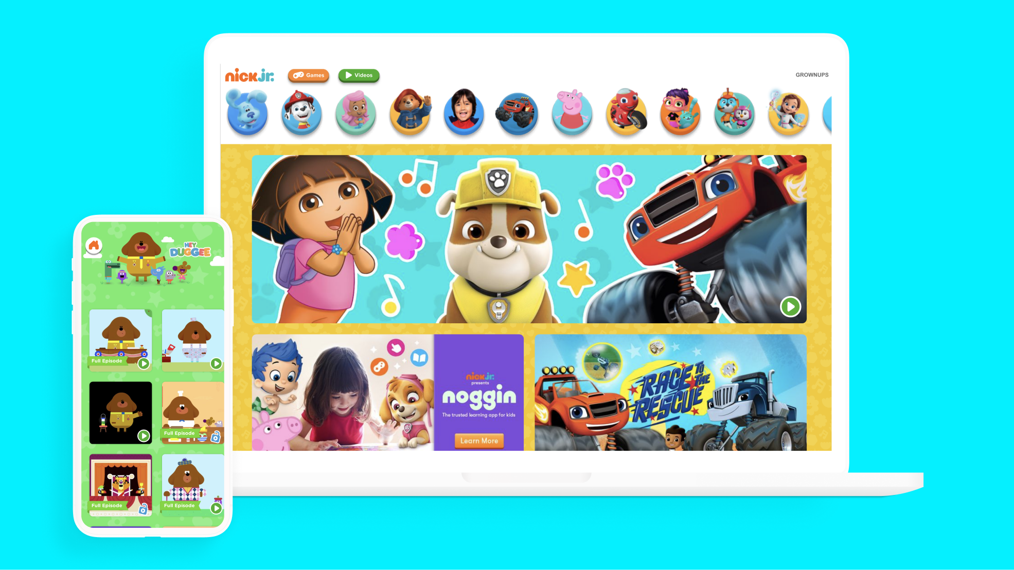
Web — unified with the core product, easy for parents to navigate alongside their kids
One experience, every screen
App intro
One of my favorite projects at Nickelodeon was designing and directing the cinematic app intro. I partnered closely with animators to create a first impression that felt genuinely magical — the kind of moment that makes a kid's eyes light up before they've even started playing. It set the tone for everything that followed and became one of the most recognized parts of the product.
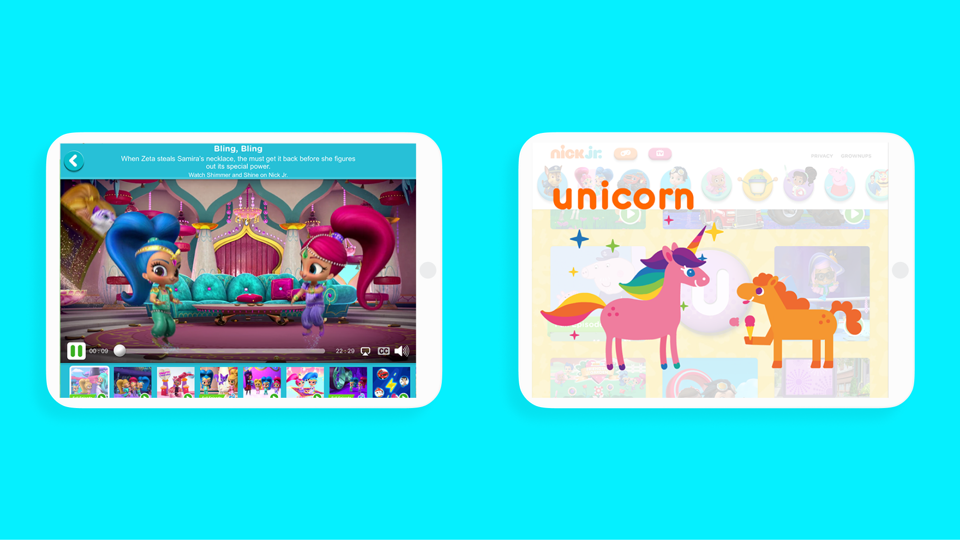
Videos
I concepted and art-directed hundreds of short-form videos across TV and mobile — educational, entertaining, and designed to work on a preschooler's terms. Partnering with animators and illustrators to bring these to life was some of the most creatively satisfying work I've done. Watching kids engage with content you made for them never gets old.
Impact
300% increase in DAUs
From a fragmented experience to millions of daily users — a product kids and parents came back to every day.
Multiple Webby Awards
Nick Jr.'s digital experience set a new standards for kids' entertainment, including Best Parent/Family Site and multiple Webby Awards
Over 47 million downloads
Across the Nick and Nick Jr. apps — a massive reach that made it one of the most widely used kids’ digital platforms of its time.