
Seamless flight booking experience
ROLE
Senior Product Designer
TEAM
Product owners, engineers
COMPANY
JetBlue
STARTING POINT
Making fare selection clearer on mobile
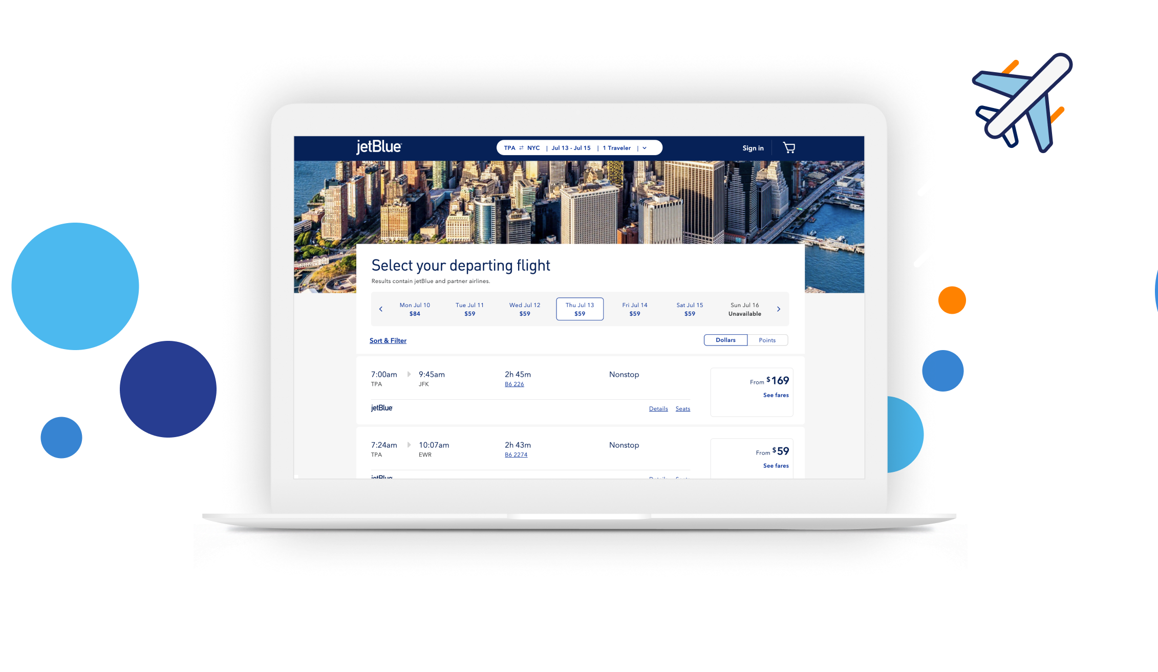
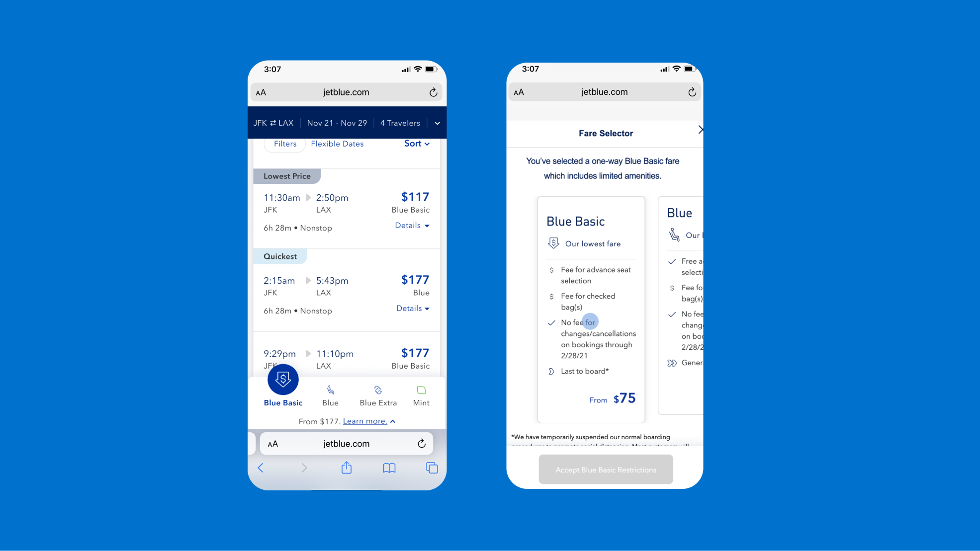
JetBlue’s mobile booking experience made it difficult to compare fares and to understand how to proceed. Small text and icons reduced readability, while travelers had to scroll both horizontally and vertically to see fare benefits and restrictions. Selecting a fare required multiple steps, and users were leaving the page before completing their selection.
Safari’s bottom address bar further crowded the screen, competing with the fare selection controls.
The opportunity was to simplify fare comparison, make the next step obvious, and help travelers confidently choose the right fare.
RESEARCH
Understanding where travelers struggled
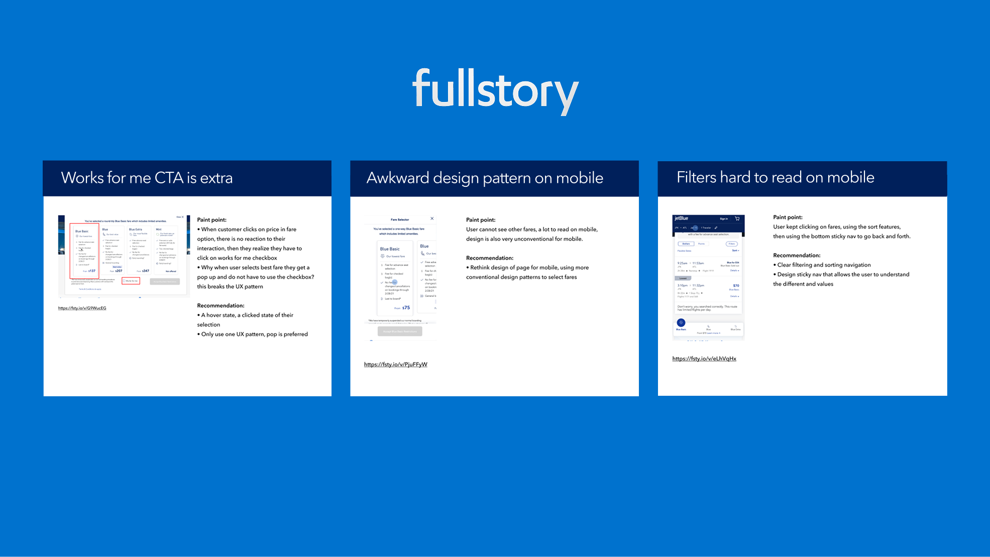
I reviewed FullStory session recordings to identify friction in the booking experience. Three key issues emerged:
Unclear fare selection: Travelers clicked fare prices without receiving feedback, then had to find a separate “Works for me” checkbox to continue. Selection patterns also differed across fares.
Difficult fare comparison: On mobile, travelers couldn’t easily see all fare options and benefits together, making comparison cumbersome.
Disconnected filters and navigation: Travelers moved back and forth between fares, sorting, and the sticky bottom controls, struggling to understand what each fare included.
These findings guided my focus: simplify fare selection, improve mobile comparison, and make filtering and navigation clearer.
MARKET RESEARCH
Exploring fare selection patterns
I reviewed airline and travel booking experiences and identified three common patterns: fare selection in a modal, an inline dropdown, or an upsell after flight selection.
These insights helped shape a clearer approach to fare comparison and upgrades for JetBlue.
USER RESEARCH
Testing fare comparison concepts
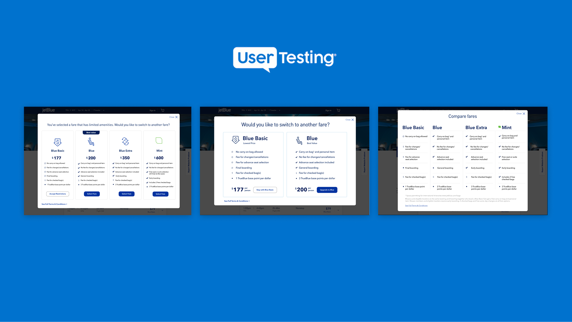
I I designed three prototypes and tested them through UserTesting, exploring different fare options, layouts, and levels of detail.
Price drove decisions, while a “Best value” label encouraged upgrades. Participants struggled to distinguish fares by name alone and found several icons unclear.
These findings guided a simpler approach: less copy, clearer benefit cues, and prominent selection buttons.
SOLUTION
Clearer choices, stronger results
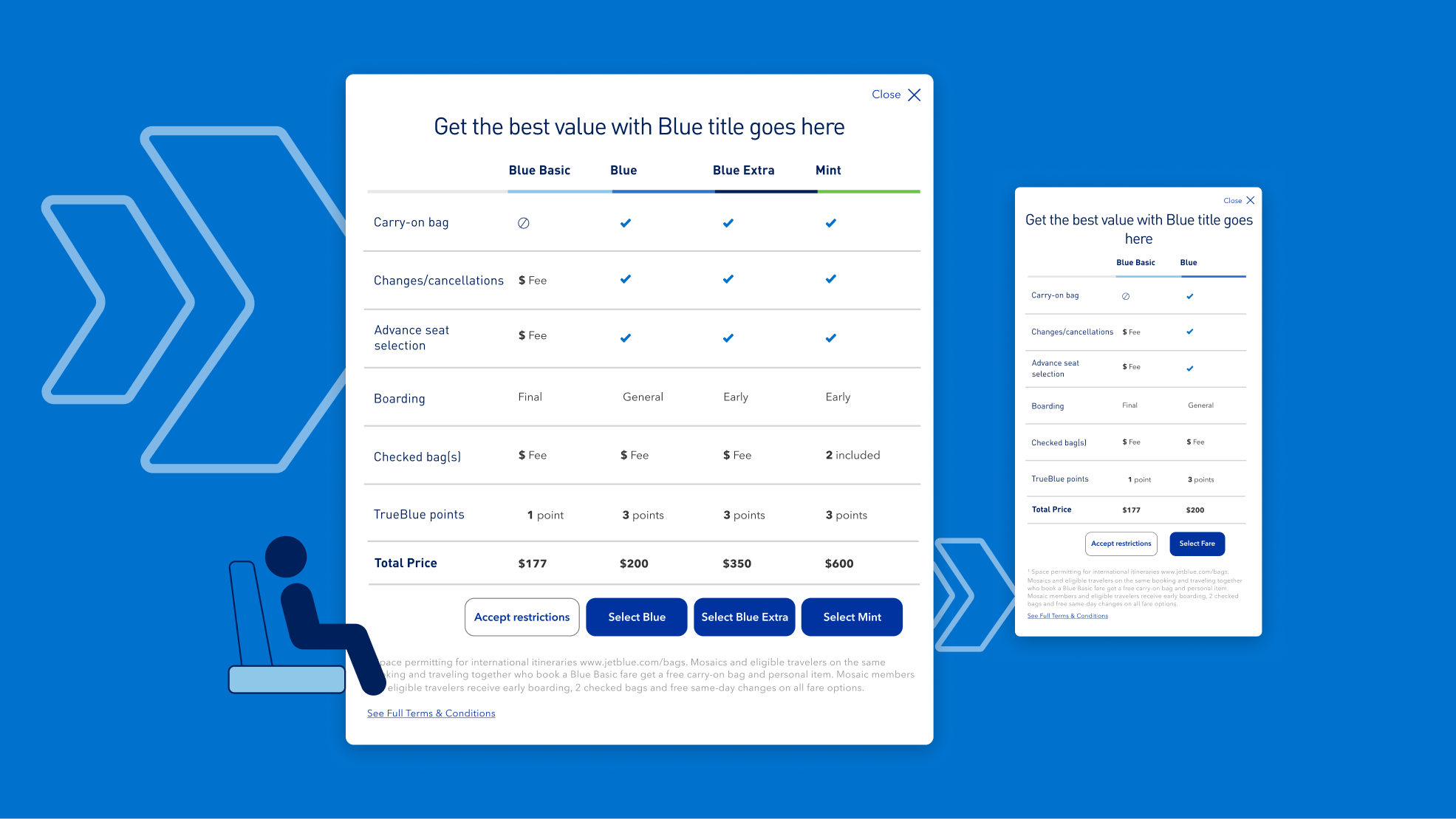
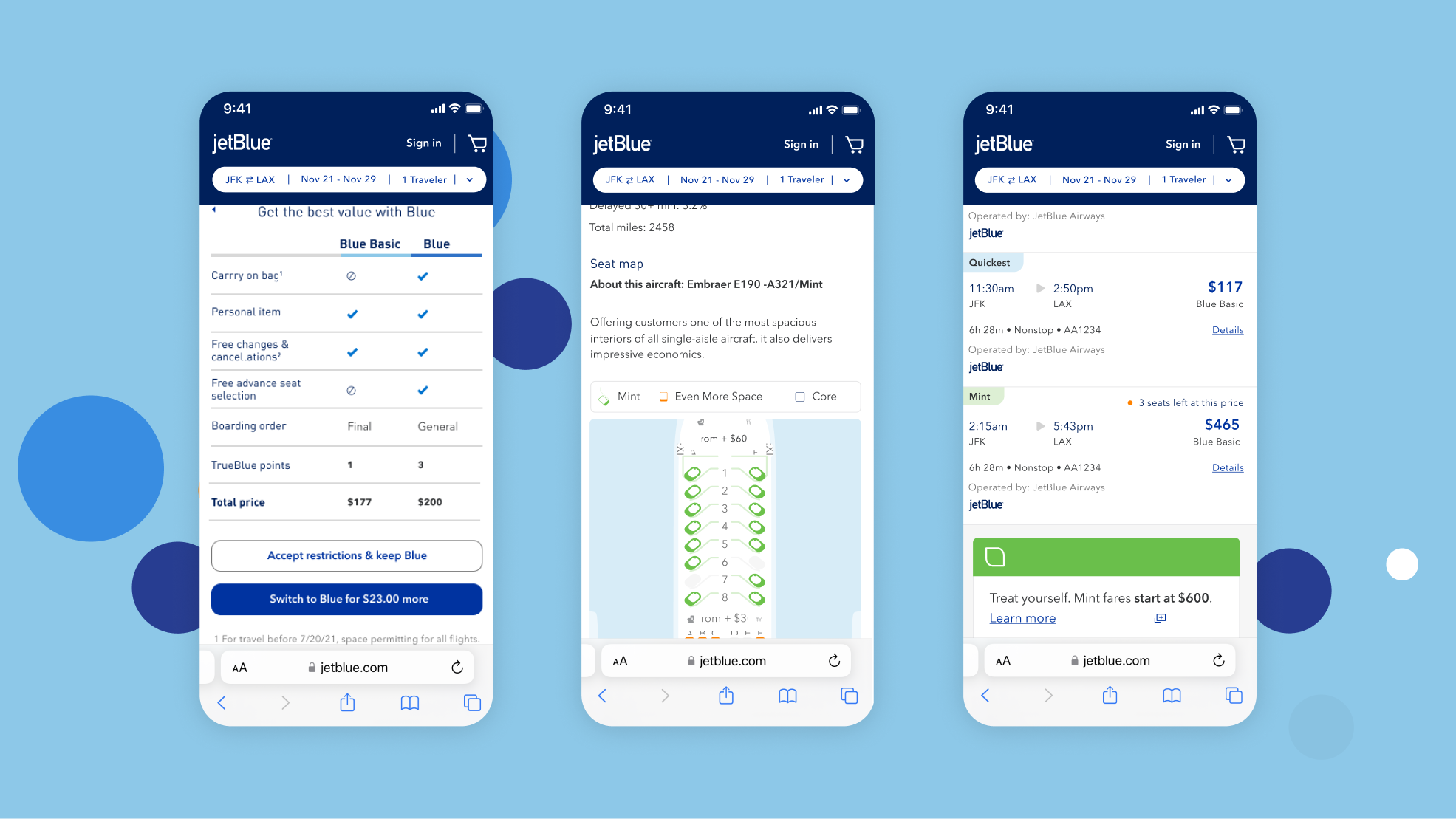
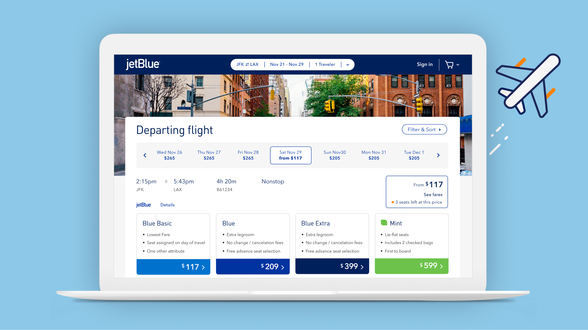
I redesigned fare selection with a side-by-side comparison of benefits and prices, clear selection buttons, and a simplified two-fare view on mobile.
The final experience made fares easier to compare and select, improving usability and contributing to a 27% increase in upgrade sales.
NEW SEARCH AND FILTERS
Simplifying flight discovery
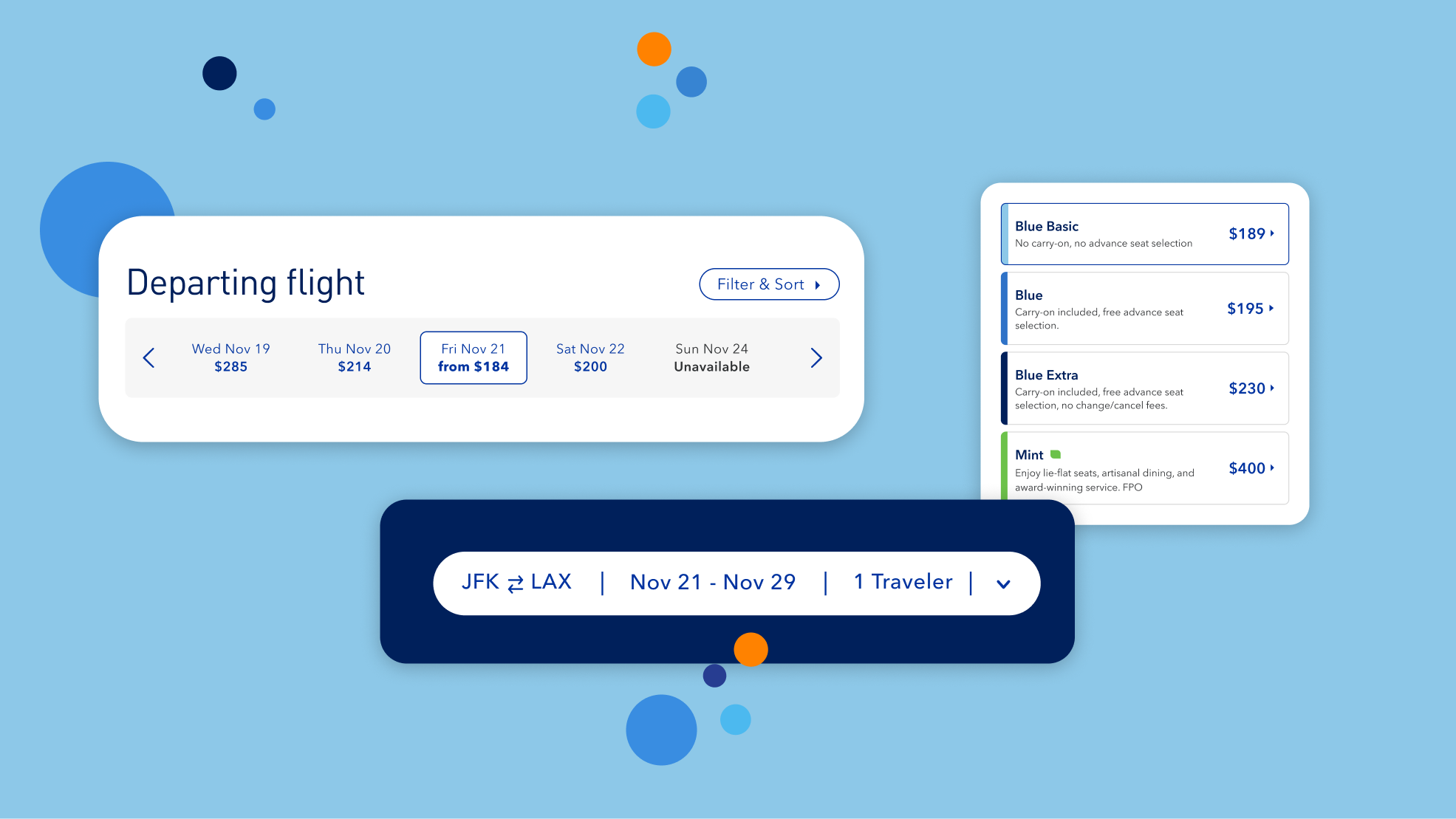
I extended the redesign to fare filters and booking navigation, bringing filter and sort controls together, making nearby dates and prices easier to scan, and clarifying fare benefits.
An updated trip summary kept routes, dates, and traveler details accessible as travelers explored their options.
Impact
Simpler booking experience
Clear fare benefits, direct selection buttons, and improved filters and navigation made flights easier to explore, compare, and choose.
27% increase in upgrade sales
Clearer fare comparisons helped travelers understand the value of upgrading, contributing to a 27% increase in upgrade sales.